Why Some Betting Sites Feel Instantly Familiar and Others Never Do
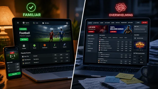
There is a particular moment that happens within the first ten seconds of opening a betting or casino platform for the first time. Something in the layout, the loading speed, or the way a menu responds to a click either puts a visitor at ease or sends them looking for the back button. This reaction rarely has anything to do with bonuses or odds. It is almost entirely psychological, rooted in how quickly a screen can convince someone that the operation behind it is competent and safe.
That split-second judgment is why interface design has quietly become one of the most decisive factors in online gambling, arguably more influential than promotional offers. A user does not read terms and conditions before deciding whether to stay on a page; they scan colors, spacing, and menu logic. When a destination such as https://www.dubibet2000.com/en/ is structured so that sports markets, live tables, and account settings are each exactly where a visitor expects them to be, the platform is silently communicating reliability before a single wager is placed. Confusion, by contrast, reads as risk, even when the underlying business is entirely legitimate.
The Anatomy of a Trustworthy First Impression
Trust online is built from small, repeatable signals rather than one grand gesture. Researchers studying digital behavior often point to a handful of cues that users process almost instantly:
-
Visible licensing or regulatory information placed near the footer, not buried in a submenu
-
Clear, jargon-free explanations of deposit and withdrawal timelines
-
Consistent visual branding across every page, avoiding jarring style shifts
-
Working customer support access within two clicks of any screen
-
Realistic, non-exaggerated promotional language
None of these elements guarantee fairness on their own, but their absence almost always triggers hesitation. A missing license badge or a support link that leads to a dead page does more reputational damage than a mediocre odds margin ever could, because it suggests the operator has not invested in the basics of user reassurance.
Design Choices That Either Reduce or Create Friction
Usability is often discussed as a convenience issue, but it functions more like a filter for patience. Every additional tap a user needs before placing a bet is a moment where they might reconsider entirely. Consider two hypothetical registration flows:
-
A form asking for email, password, and a single verification step, completed in under ninety seconds
-
A form requiring ten fields, a CAPTCHA, an SMS code, and a follow-up email confirmation before any interaction with the site is possible
The first flow assumes the user's time is valuable and defers deeper verification to later stages, such as withdrawal. The second flow front-loads friction, which statistically correlates with higher abandonment, according to general e-commerce usability studies. Betting platforms face the same dynamic as any checkout page: complexity introduced too early reads as an obstacle rather than a security measure, even when the intention behind it is protective.
Mobile responsiveness compounds this effect. A desktop-first design that simply shrinks on a phone screen, with tiny buttons and horizontal scrolling, signals that mobile users were an afterthought. Given that a large share of betting activity now happens on handheld devices during commutes, breaks, or live sporting events, that afterthought becomes a daily irritation rather than a rare inconvenience.
Cultural Expectations Shape What "Trustworthy" Even Looks Like
Design perception is not universal. A layout considered clean and modern in one region may feel sparse or unfinished in another, where users associate density of information with thoroughness rather than clutter. In several Latin American and Southern European markets, for instance, users often expect visible odds boards, live scores, and promotional banners to be present simultaneously on a homepage, treating a busier layout as a sign of an active, well-resourced operator.
Language localization plays a similar role. A platform that translates its interface but leaves payment instructions or support scripts in awkward, machine-translated phrasing undermines the very confidence its visual design worked to build. Users notice inconsistency faster than they notice polish, which means half-finished localization can be more damaging than no localization at all, since it exposes a gap between appearance and substance.
Usability as an Ongoing Test, Not a One-Time Launch Decision
Interfaces that felt modern three years ago can feel dated today, not because the underlying technology failed, but because user expectations shift alongside broader internet habits. A checkout process modeled on 2019 mobile banking conventions may now feel sluggish compared to the one-tap confirmations common in current ride-sharing or food-delivery apps. Betting platforms are judged against that entire digital environment, not merely against competitors within the same industry.
This is why usability testing benefits from being continuous rather than a pre-launch checklist. Practical steps that responsible platforms tend to revisit periodically include:
-
Reviewing load times across low-bandwidth mobile connections, not just office wifi
-
Testing withdrawal flows personally, on a recurring basis, rather than relying on internal reports
-
Watching real users navigate the site without guidance, to catch friction points staff no longer notice
-
Auditing whether error messages explain what went wrong, instead of displaying generic codes
Small adjustments, such as clarifying why a deposit was delayed or simplifying a verification step, rarely generate headlines, but they accumulate into the difference between a platform users return to and one they quietly abandon after a single frustrating session.
Trust in digital betting environments is rarely won through a single feature or lost through a single flaw. It is assembled gradually, through consistent, unremarkable moments where a page behaves the way a visitor expects it to. Design and usability, in that sense, are not decoration layered on top of a betting product; they are the product's first and most persistent argument for why anyone should feel comfortable staying on the page long enough to place a bet at all.