Iconic Airline Logos: Design and Branding Lessons
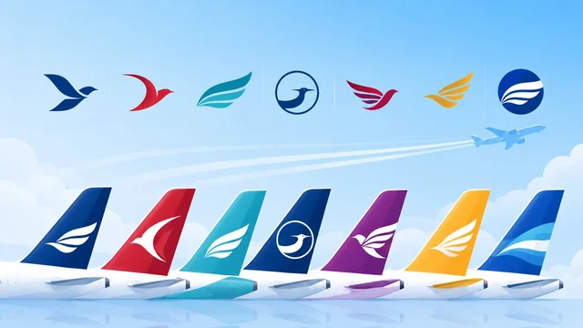
Airline logos are some of the most recognisable brand marks in the world — flown across the globe, they have to convey trust, speed and identity in a single glance. From timeless classics to bold redesigns, here's a look at iconic airline logos, what makes them work, and the design lessons behind them.
What Makes a Great Airline Logo?
The best airline logos share a few qualities: they're simple and instantly recognisable, work at any size (from a tail fin to an app icon), use colours that evoke trust and the brand's heritage, and often include a symbol of flight or motion — a bird, a tail, a swoosh or a national emblem. Because airlines are global, their logos must also translate across cultures and look great on everything from boarding passes to a 70-metre aircraft.
Iconic Airline Logos and Their Stories
- Lufthansa — its encircled crane is one of the oldest and most respected logos in aviation, conveying elegance and reliability with minimal change for decades.
- Emirates — flowing Arabic calligraphy paired with bold red, instantly signalling luxury and its Middle Eastern roots.
- Singapore Airlines — the stylised "silver kris" bird is sleek, premium and unmistakable.
- American Airlines — its modern "flight symbol" (an abstract eagle and tail) reflects the carrier's 2013 rebrand toward a cleaner, contemporary look.
- British Airways — the flowing "Speedmarque" ribbon suggests motion and Britishness.
- Qantas — the "Flying Kangaroo" is a brilliant piece of national branding, evolving subtly over the years while staying iconic.
- Delta Air Lines — its red “widget,” a stylised delta triangle, is clean, confident and unmistakably American.
- Air France — the elegant red-and-blue stripe and refined wordmark convey French chic and premium service.
- KLM — the little blue crown, in use since 1919, is one of aviation’s most enduring marks.
- Turkish Airlines — a grey wild-goose silhouette in a red roundel blends national symbolism with a sense of flight.
- Japan Airlines — the “Tsurumaru” red crane is a masterclass in minimal, culturally rooted design.
Design Trends in Airline Branding
Airline logo design has trended toward simplicity and flexibility, with carriers favouring clean symbols that scale well to digital screens and app icons. Many use a single strong colour tied to national or brand identity, and motifs of flight, wings or motion. Rebrands are risky and closely watched — a successful one (like American's) modernises without losing recognition, while a poorly received one can spark backlash from loyal flyers.
Many of these marks have quietly evolved over decades — refined, flattened and simplified for the digital age — without losing the core idea that made them recognisable. That restraint is the real art: a great airline logo earns trust precisely because it feels familiar. For a deeper dive into the craft, resources like Logo Design Love are full of case studies on how identities like these are built and maintained.
Lessons for Logo Designers
Even if you're not designing for an airline, these logos offer timeless lessons: keep it simple, make it scalable, choose colours with meaning, and aim for a mark that's memorable and ownable. The strongest airline logos prove that a single, well-crafted symbol can carry an entire brand around the world.
Frequently Asked Questions
What is the most recognisable airline logo?
Lufthansa's encircled crane, Qantas's Flying Kangaroo and Singapore Airlines' silver-kris bird are among the most recognisable, thanks to their simplicity, longevity and strong national identity.
Why do airline logos often feature birds or wings?
Birds and wings symbolise flight, freedom and motion, making them a natural fit for aviation brands. They convey the core promise of air travel — getting you off the ground — in a single, universally understood image.
What makes a good logo in general?
A great logo is simple, memorable, scalable to any size, appropriate for the brand, and uses colour with intent. Airline logos are excellent examples because they must work everywhere from a tiny app icon to a giant aircraft tail.
Why do airlines rebrand their logos?
Airlines rebrand to modernise their image, reflect new strategy, or improve how the logo works across digital platforms. Successful rebrands refresh the look while keeping enough recognition that loyal customers still feel a connection.
Final Thoughts
Airline logos are masterclasses in branding — simple, meaningful symbols that fly around the world and stay in our memory. Whether you're a frequent flyer or a designer, studying marks like Lufthansa's crane or the Flying Kangaroo reveals how much identity a single great logo can carry.