The Art of Creating Realistic Ice Effects in Digital Photography
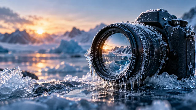
Digital photography has moved well beyond simply recording whatever happens to be in front of the camera. Modern editing techniques let photographers, designers, content creators and everyday users change the whole atmosphere of a picture by adding visual elements that were never there when the shutter clicked. Ice effects are a good example. They can make an ordinary photograph feel several degrees colder, turn a sunny July afternoon into a crisp winter scene or create the look of frozen objects and glassy, icy surfaces.
Getting ice effects to look convincing takes more than dropping a few white or blue shapes over an image, though. Lighting, texture, transparency, shadows and perspective all decide whether the result looks natural or obviously fake. Anyone who understands these basics is in a far better position to produce digital images that people believe at first glance.
Understanding the Visual Characteristics of Ice
Ice behaves differently from almost any other material. Depending on how thick it is, how cold it is and what surrounds it, it can look clear, slightly cloudy, milky or almost completely white. Its surface can mirror nearby objects, scatter light in odd directions and throw back sharp little flashes of brightness.
All of this matters when editing a photograph. A thin layer of frost usually has a soft, sparkly, crystal-like look, while a thick block of ice tends to hold deeper blue tones and visible patterns inside it. Frozen water on a window often forms delicate, uneven patterns around the edges, the kind people notice on a car windscreen on a cold morning. Ice on the ground, by contrast, can look rough, patchy and shiny all at once.
Before any editing begins, it helps to think about what kind of ice would naturally belong in that particular scene. When the look of the ice matches its surroundings, the whole image feels far more real. When it doesn’t, viewers sense something is off, even if they can’t quite say what.
How Lighting Influences Realistic Ice Effects
Lighting is one of the biggest factors in believable image editing. Ice tends to pick up the colours and brightness of whatever is around it, so an added effect needs to follow the lighting that’s already in the original photograph.
In a photograph taken outdoors in bright sunshine, icy surfaces usually carry sharp highlights and crisp reflections. On a grey, overcast day, the same surfaces look softer and far less shiny. Indoor photographs lit by warm lamps tend to suit gentle blue or neutral adjustments much better than a harsh, flat white overlay that makes the room look as though it’s been sprayed with paint.
Shadows matter as well. Ice that’s meant to be sitting on a table, a window ledge or any other surface has to look as though it actually belongs there. Without the right shadows and reflections, the effect seems to hover above the photograph instead of being part of it.
A reliable approach is to adjust brightness and contrast a little at a time. Small changes usually keep more detail than big, dramatic ones. That’s especially true with transparent or reflective materials, where one heavy-handed slider can wipe out all the subtle texture in a second.
Choosing the Right Editing Method
Not every photograph calls for the same approach to creating frozen textures. Professional editors often work with layers, masks, blending modes and custom brushes so they can control exactly where the ice appears. These methods are very flexible. They also take practice and a fair bit of technical know-how.
Simpler editing tools come in handy when the aim is to experiment quickly or put together an image for social media. Some browser-based editors offer dedicated effects that make it far easier to try out icy looks without building every texture by hand. For example, users who want to add ice to photo can explore a dedicated image-editing option as part of their creative workflow.
Whichever method is used, the original subject is best kept recognisable, unless a complete transformation is the whole point. Keeping the effect in step with the image’s composition helps the picture stay clear and easy to read.
Practical Applications of Ice Effects
Ice effects turn up in all sorts of digital media. Travel photographers can use them to create seasonal versions of their landscape images, showing the same mountain view in summer and in the depths of winter. Designers often bring frozen textures into posters, invitations and winter-themed graphics.
Social media creators frequently use icy treatments to set a particular mood. A portrait with a light touch of frost around the edges can suggest a winter atmosphere straight away, while a product photograph covered in frozen droplets can make a drink look refreshingly cold on a hot day. In digital storytelling, frosted windows, icy paths and snow-covered objects can establish a setting without anyone having to wait months for the weather to change.
These effects can support educational projects too. A presentation about freezing temperatures or winter weather, for instance, might use carefully edited images to show how ice changes the look of everyday materials, which tends to stick in the mind far better than a paragraph of text.
Common Mistakes to Avoid
One of the most common mistakes is spreading the same texture evenly across the entire image. Real ice forms unevenly, depending on moisture, temperature and the surface underneath it. Patchy, varied patterns placed with some thought usually look far more convincing than a perfect, uniform coating.
Too much saturation is another frequent problem. A strong blue filter certainly says “cold”, but it can also make an image look artificial, a bit like a poster for a frozen-food aisle. Real ice can reflect blue surroundings, yet it often contains grey, white and almost colourless areas as well.
Poor edge blending gives the game away quickly. If the ice texture stops in a hard line that doesn’t follow the shape of the object, viewers spot it as an overlay almost immediately. Masks, transparency adjustments and careful feathering help soften those transitions so the ice seems to grow out of the surface.
Finally, important details are best left visible. Faces, product labels, architectural features and other focal points need to stay clear unless covering them serves a genuine artistic purpose. Nobody wants a frosty portrait where the person’s eyes have vanished under a sheet of ice.
Tips for Improving Image Quality
A good result usually begins with a photograph that has decent resolution and clear lighting. Images with visible surface detail give realistic textures something solid to build on. Making changes gradually, comparing the edit with the original every so often and checking the result both at full size and as a tiny thumbnail all help catch problems early.
The intended platform makes a difference too. Images meant for phone screens often benefit from stronger contrast, since they’ll be seen small and in a hurry. Photographs destined for print usually need more careful attention to fine texture and subtle shifts in tone, because every flaw shows up on paper.
Keeping an untouched copy of the original image makes experimenting much less stressful. Any adjustment can be undone without losing the source material, and it helps keep the editing process consistent from one image to the next.
Conclusion
Creating realistic ice effects in digital photography brings together artistic judgement and an understanding of light, texture, transparency and perspective. The most convincing results come from treating ice as a real material with its own physical properties, not just a cold colour filter thrown over the top.
Whether the work is done in advanced editing software or a simple online tool, creators can get much better results by studying the original lighting, placing textures selectively and holding back on heavy effects. With thoughtful adjustments and regular practice, ordinary photographs can become convincing winter-inspired visuals while keeping their essential details and natural composition intact.