How to Design Mobile Native Ads That Blend Perfectly Into User Feeds
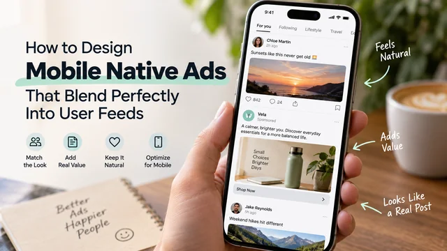
A native ad will only work if it no longer appears to be an ad. This is the whole idea of the format and the reason why most teams fail - they use a default template, change a title, and are surprised why the involvement is similar to the previous banners. The perfect mix is the right design and then the right audience.
The Anatomy Of A Native Ad, And Why Every Piece Matters
Each native ad is made of the exact same five parts - icon, title, description, media asset, call-to-action. Networks like AdMob and Meta Audience Network expose those as separate elements specifically so you can style them yourself instead of just taking a fixed layout.
That separation is the whole opportunity. When you control the size of the icon, the font weight of the title, the spacing between description and CTA, you can make the ad card match your feed's existing content cards almost exactly. Skip that step and you get a native ad that's technically "native" by format but visually foreign - wrong corner radius, wrong font, wrong padding. Users don't need to consciously notice the mismatch to feel it. Their scroll speed just picks up.
Treat each component as a variable, not a fixed slot. The icon should sit at the same size and position as a profile picture or brand avatar elsewhere in your feed. The title should use your app's actual heading font, not whatever the network defaults to. The description text should wrap the same way your organic post captions wrap. Small stuff, but it adds up to either "this belongs here" or "this doesn't."
Copy The Feed's Visual Grammar Exactly
This is when styling tools become incredibly useful. AdMob's native template styles allow you to configure the corner radius, background color, font family, and shadow depth directly on the ad card. When working with Android, you are usually dealing directly with XML layouts to display the native ad view. This gives you total control over margins, elevation, and typography to the last pixel.
The principle is easy: open your feed's current content card and your native ad card next to each other. Compare corner radius. Compare drop shadow intensity. Compare the gap between the media asset and the text block below it. If anything seems slightly off, a user will notice it, although unconsciously.
The font family matters more than people expect. A native ad using the system default font while displaying content utilizing a custom brand typeface is an immediate giveaway. It's quite cheap to integrate your app's font resource into the ad template, and it provides one of the biggest advantages available.
Spacing and padding should be treated equally. Feed cards generally have uniform internal padding, equal gaps between items, and consistent line-height on body text. Native ad SDKs tend to come with slightly different default settings. Modify them. This might be boring work, but it makes a difference between an ad that seems to be sponsored content and one that appears to be a general ad unit that is sponsored.
Choose Media Dimensions For Where The Ad Actually Sits
Choosing the correct aspect ratio is more than just a detail you consider when creating an ad; it impacts the entire creative process and overall quality of your content. Depending on the platform or type of content, there are likely a few ratios that will work for you. But context is key.
Maybe you'd like to create a testimonial ad with quotes sandwiched between black bars, or maybe you're going for something truly unique and disruptive that demands people turn their phones. Either can be great, but you'll need to know your destination before deciding. Emotion? Awareness? Clicks? These will all pull you in different directions.
Don't let aspect ratio be an afterthought; your aesthetic - and ultimately results - require deliberate, consistent choices like any other creative element.
Loading Speed Is Part Of The Design, Not A Technical Footnote
When an advertisement appears too late, or even worse, there is a delay in displaying it, which leads to a gray area while it is being uploaded, all the magic is lost. Users are constantly scrolling. A layout displacement when the screen changes because of a late advertisement is another way to ensure that users know this is an advertisement, even before they read the contents.
There are two solutions. Firstly, make all media files as small as possible - the image or video of the native ad doesn't need to be in HD, just to be displayed before the user naturally sees it. Secondly, don't wait until the ad slot is visible to make the request for the native ad - do it before, so it has time to load. In fact, if you're using an ad mediation system that requests from multiple networks and always has a fallback, latency is likely to be reduced.
The performance of a native ad, and how visible it is to the user, are not two separate things. A pixel-perfect stylish card that is only five milliseconds late is still a failure.
Production-Ready Implementation And Network Rendering Choices
Once you have your styling rules set in stone - matching fonts, corner radius, spacing, and correctly scaled aspect ratios - the best way to confirm everything's been defined correctly is to evaluate how an actually well-built unit renders with live data. A good reference point is checking out native ads on android, which offers a pre-designed, production-ready template with multiple variants and a reference layout for resizing and scaling. Cross-referencing the feed's component hierarchy against a reference like this makes it far easier to catch where your own rules break down - spotting what you got wrong is a lot simpler than guessing what the rules should have been when you're too close to the design to see the discrepancies yourself.
This is where your choice of SDK begins affecting more than how easily your developers can implement your design. How the network abstracts the icon, title, description, media, and CTA as individual renderable views dictates how much freedom you actually have in positioning a native ad unit on your card's layout. Some ad networks package components far more liberally than others. If your feed has a specialized layout that doesn't match the vertical card the network provides, you want an SDK that grants you latitude in repositioning components instead of locking you into a pre-ordained template.
Match Ad Content To What's Actually On Screen
While everyone is talking about behavioral targeting, it's really the contextual fit that determines whether an ad feels at home in a given feed. A health and wellness ad in a health and wellness feed appears relevant. The same health and wellness ad in a sports blog appears less so, even if the second site is full of health/fitness browsing history cookies.
Algorithmic contextual targeting does nothing more complex than look at what's on the page and decide what ads seem related to the content. No heuristics about who the user is or what they've done in the past, other than that users reading a sports blog are likely interested in sports.
It's a simpler approach than hyper-targeting and less likely to induce the "creepy" reaction in users. Most importantly, it will fail less often at scale. A news article about a transit strike containing contextually targeted car ads looks jarring. Those same ads targeted to the user based on the last car website they visited might not fit well either, but at least the impulse buy is less directly antagonistic toward the declared interests of the content.
Keep The Disclosure Honest But Quiet
Every advertisement in a native context must include a "Sponsored" or "Ad" label. To comply with regulations and adhere to the platform's rules, this label should be relatively easy for a user to see and read, but doesn't need to dominate the advertisement itself. The user is your customer, not the advertiser. Large, attention-grabbing text and bright colors can unsettle the user experience you've worked hard to create. Instead, consider how Twitter uses a small, secondary text notice at the bottom of a sponsored post.
The same logic applies to placement, not just size. Put the label somewhere a user would naturally look if they were checking - near the account name or in the corner of the media asset - rather than tucking it somewhere technically visible but practically invisible. Compliance isn't about satisfying a checkbox; it's about a user being able to identify sponsored content at a glance if they care to, then going back to scrolling if they don't.
Write Copy That Sounds Like A Post, Not A Pitch
The tone of voice is often the reason why native ads that are well-designed fail. The copy in the ad must seem like a real post from a person or a brand, not like a headline in a newspaper that has been forced into the space.
Get rid of multiple exclamation points. Eliminate common CTAs such as "Shop Now." Instead, use a phrase that is consistent with the way the ad speaks to its followers - for example, "Read more" or "Try it out." Although it may prompt more clicks, clickbait language clearly identifies an ad more directly than a visual inconsistency.
One line is enough: short copy that doesn't look like an ad is more likely to blend in than longer, punchier copy that's obviously from an ad.
Test The Hero Image And Headline Relentlessly
Native ad creatives become exhausting to the target audience at a faster rate than display ads. The winning image and headline that brought in a good CTR last week won't maintain that level of engagement if your frequent users see it multiple times in their feeds. If you can quickly A/B test the hero image and the headline - just those two components of your ad creative, not an entire ad card - you can identify exhaustion early and rework before you miss your numbers.
Hold everything else static while you test the image or test headlines. Isolate variables so you have a clue what you're doing.
The numbers prove the value of best practices here. The average viewer looks at an in-feed native ad 53% more frequently than a display ad. And makes an 18% stronger lift in purchase intent (IPG Media Lab / Sharethrough).
Where Teams Usually Go Wrong
Most failures with native ads happen because people default SDK style and never override it, serve the wrong aspect ratio into a placement, or write sound-like-an-ad copy because no one really thinks to adjust the tone. None of those issues require new technology to fix. They require someone caring enough about those pixels who's not external to the process and who treats them with the same design discipline as any other piece of UI in the app.
That's really the whole craft. A native ad isn't a creative asset dropped into a slot - it's a UI component that happens to be sponsored. Design it like one, and the blend takes care of itself.