Most modern online audiences use mobile devices, and they are taking over. Thus, as a site owner, you should know that mobile web design is not an option, but the best way.
The number of mobile web users is increasing every year and currently, it is estimated that more than sixty per cent of visitors of site visitors use mobile devices. This implies that they utilise smartphones and tablets to visit your website.
Not optimizing your website for mobile not only has negative effects on the usability or user experience (UX) but also search engine results page optimization (SEO), and basically, your site may just get buried under an enormous heap of competitors.
I will explain how it is possible to ensure that a website is properly optimized for mobile devices, and to fit the overall layout and design of your website, all while increasing the usability and appeal for the benefit of its visitors and increased SEO presence on the Internet.
User Reigns Supreme: Prioritizing UX for Mobile
Imagine this: It is lunchtime, and you are holding your phone and ready to look into this site.
However, the moment one opens the page, one finds that all texts are almost invisible with unbelievably small fonts, the menus are extremely clumsy, and the buttons can hardly be clicked without the precision of a surgeon.
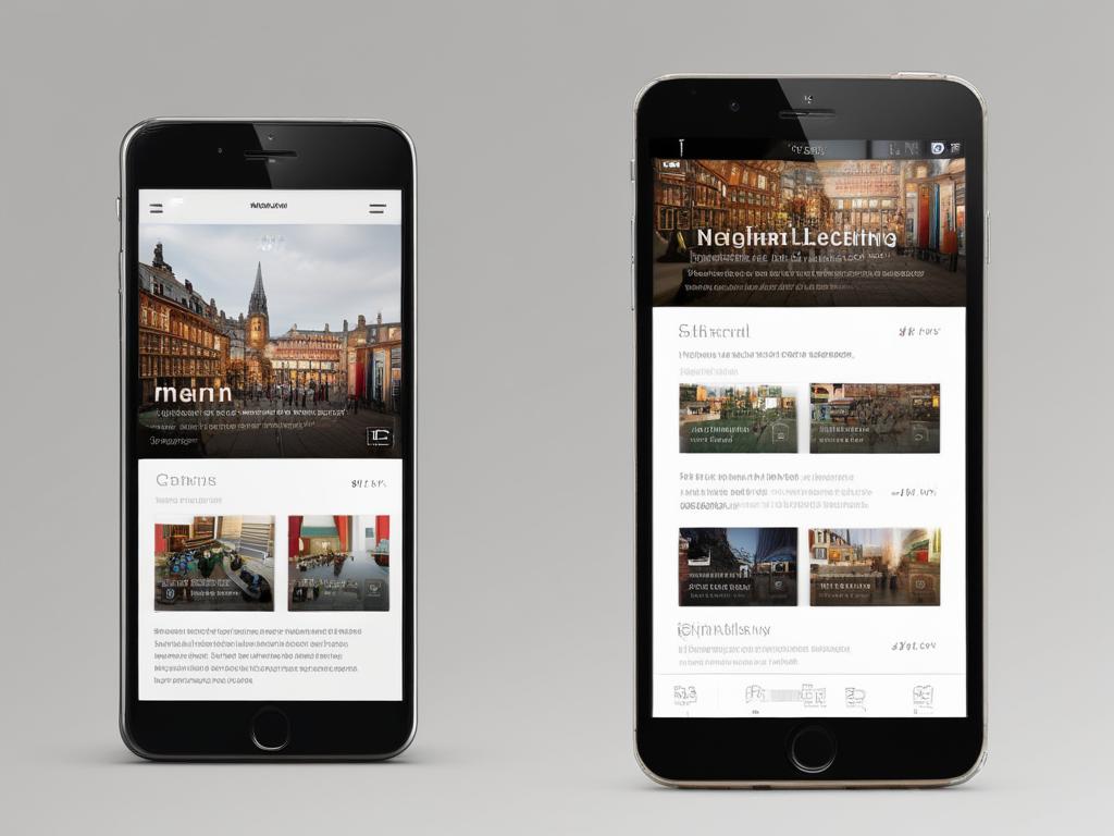
Web Design that is optimized for desktop alone results in poor mobile web experience due to limited display space and reduced readability. This is why your business should hire a web design agency that is proficient in mobile UX design.Â
How to ensure your mobile visitors have a smooth and enjoyable ride
These steps will ensure that your website looks good and is intuitive on the web, tablets, and smartphones.
Embrace Readability
A small display makes it necessary to use clean and simple language which users can easily comprehend. Large buttons should be used and there should be space in between them. Also, the menu should be easily clickable with a single tap.
Think Thumbs, Not Cursors
Mobile users use their thumbs to operate their mobile devices and therefore the design has to accommodate this.
Mobile tap targets should be kept to a minimum of 48px by 48px to enhance ease of use.
Legible Text
Typefaces are very important for creating a pleasant experience for users, regardless of their mobile devices or screen sizes. We now live in a content-driven world where a lot revolves around content.
So be sure to opt for a typeface that is highly functional in a wide range of sizes and weights. Typically, an 11-point font and above is known to lower visual fatigue.
Some examples of highly recommended simple-to-read typefaces include Merriweather, Sans Serif, Proxima Nova, Sofia Pro and Roboto.
Improved User Engagement Signals
The benchmarks for mobile-friendly websites are higher in terms of engagement and metrics such as time on page and lower bounce rates.
All the positive user signals to the website are incorporated into the SEO algorithms which enhance your ranking on the search engine.
This has the potential to make the site not only visually pleasing from a user’s perspective but also easily findable from a search engine.
It is also recommended that you make use of AMP to enhance the speed of the website some more.
Content Placement
Most people think because a screen is smaller, one would have to jam-pack their content in a way to align it properly. This isn’t right. By structuring your page to fit your content placement, you can easily achieve this.
Since you can be easily distracted while using our mobile devices, place priority on your landing page to capture the interests of your visitors.
Why is mobile UX important?
Here’s why: Mobile-First Indexing. In 2018, Google declared that mobile-first indexing ceases to rank websites based on desktop experience.
It is almost as if a website that does not have mobile versions as well, it does not exist in the eyes of the Search Engines on mobile devices.
Mobile visitors are even less patient and will not wait for a site to load for several minutes.
The use of mobile websites that load faster not only benefits the UX but the SEO gets a ranking boost as well.By paying attention to these UX best practices you end up with a mobile website that is both functional and enjoyable to use.


