Top 13 Infographics that Mock Infographics
Infographics. They’re everywhere. In 2025, they remain a dominant force in online content, vying for our attention across social media, websites, and even email newsletters. We've all seen them: visually appealing data visualizations promising to deliver complex information in an easily digestible format. But with the sheer volume of infographics flooding the internet, a backlash was inevitable. This article celebrates the clever, hilarious, and insightful infographics that dare to mock the very medium they inhabit. Get ready for a dose of meta-humor and a critical look at the infographic craze.
Why Are Infographics So Popular (and So Ripe for Parody) in 2025?
The enduring appeal of infographics lies in their ability to present information in a visually engaging way. In a world saturated with content, they offer a quick and often entertaining alternative to dense text. For creators, infographics provide a valuable tool for:
- Boosting Brand Awareness: A well-designed and shareable infographic can significantly expand a brand's reach.
- Driving Website Traffic: Infographics often include embedded links, directing viewers back to the creator's website.
- Establishing Authority: Presenting data in a clear and concise manner can position a brand as a knowledgeable resource.
- Improving SEO: Infographics are easily embeddable, generating backlinks and improving search engine rankings.
However, the very factors that contribute to their popularity also make them vulnerable to parody. Common criticisms of infographics include:
Learn more in our article about How to Make Multiple Accounts on Twitter with same Email Address?.
- Oversimplification: Complex issues are often reduced to simplistic visuals, sacrificing nuance and accuracy.
- Data Misrepresentation: Infographics can be used to manipulate data and promote biased viewpoints.
- Design Over Substance: Style often trumps substance, resulting in visually appealing but ultimately meaningless graphics.
- Ubiquity and Fatigue: The sheer volume of infographics can lead to viewer fatigue and a sense of déjà vu.
It's this tension between the potential benefits and inherent limitations of infographics that makes them such a rich source of comedic fodder. In 2025, the infographic parody has become a genre in its own right, offering a much-needed dose of self-awareness to the world of data visualization.
Top 13 Infographics That Mock Infographics (2025 Edition)
Here are some of the funniest and most insightful infographic parodies we've found in 2025. They poke fun at everything from the overuse of stock photos to the questionable data sources often cited in these visual creations.
1. The "How Many Infographics Have I Seen Today?" Bar Chart
This classic parody, still relevant in 2025, simply presents a bar chart with an absurdly high value, illustrating the overwhelming prevalence of infographics in our daily lives. The humor lies in its simplicity and relatability. It’s a visual representation of infographic overload.
2. The "Infographic About Infographics" Meta-Masterpiece
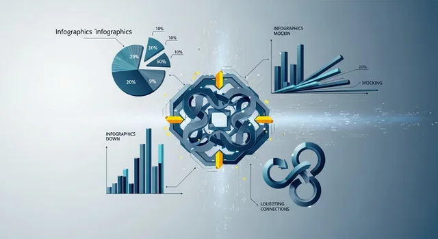
This infographic takes self-referential humor to the next level. It's an infographic about infographics, dissecting the anatomy of a typical infographic and highlighting its common tropes. It’s the infographic equivalent of breaking the fourth wall.
3. The "Infographic Generator Flowchart"
This flowchart humorously illustrates the formulaic process of creating an infographic. It mocks the reliance on templates, stock photos, and generic data, exposing the lack of originality that often plagues the medium.
4. The "Correlation vs. Causation" Cautionary Tale
This infographic parody highlights the dangers of confusing correlation with causation. It presents absurd examples of seemingly related phenomena, reminding viewers to critically evaluate the data presented in infographics.
5. The "Bad Stock Photo Infographic"
This infographic is dedicated to showcasing the worst stock photos used in infographics. It pokes fun at the cheesy smiles, awkward poses, and bizarre scenarios that often populate these visuals.
6. The "Buzzword Bingo Infographic"
This infographic presents a bingo card filled with common buzzwords and jargon used in the business world. It satirizes the overuse of these terms in infographics and other forms of marketing communication.
7. The "Things People Pretend to Understand" Infographic
This infographic lists various complex topics that people often feign knowledge of, such as cryptocurrency, quantum physics, and blockchain technology. It highlights the tendency of infographics to oversimplify complex issues.
For more details, check out our guide on Mastodon Explained: A Practical Guide to the Twitter Alternative.
8. The "How to Spot a Bad Infographic" Checklist
This infographic provides a checklist of red flags to look out for when evaluating an infographic. It includes criteria such as poor data visualization, lack of sources, and biased presentation.
9. The "Infographic About Procrastination"
This infographic ironically procrastinates on providing any actual information, instead offering excuses and distractions. It's a humorous commentary on the tendency to put off important tasks.
10. The "Data Visualization Disaster"
This infographic intentionally violates every principle of good data visualization, creating a confusing and unreadable mess. It serves as a cautionary tale of what not to do when creating an infographic.
11. The "Infographic About Cats" (with Completely Made-Up Statistics)
This infographic presents a series of absurd and unsubstantiated facts about cats. It satirizes the tendency of infographics to rely on questionable data sources.
12. The "The Evolution of the Infographic" (Parody Timeline)
This timeline humorously traces the evolution of the infographic from its humble beginnings to its current state of ubiquity and self-parody.
Related: Intentional Social App Tangle Aims to Redefine Online Life.
13. The "Ultimate Guide to Creating an Awful Infographic"
This infographic provides a step-by-step guide to creating the worst possible infographic. It covers everything from using Comic Sans font to filling the graphic with irrelevant clip art. This is satire at its finest, offering a hilarious and informative look at what not to do.
The Future of Infographics (and Their Parodies) in 2025
While the infographic market remains strong in 2025, there's a growing demand for more sophisticated and data-driven visualizations. Here's a look at some key trends:
- Interactive Infographics: These allow users to explore data in a more engaging and personalized way. Expect to see more use of JavaScript libraries like D3.js and charting libraries such as Chart.js.
- Data Storytelling: Infographics are increasingly being used to tell compelling stories with data, rather than simply presenting raw numbers.
- AI-Powered Infographic Creation: Tools like Visme (basic plan starting at $29/month in 2025) and Canva (Canva Pro, $12.99/month in 2025) are integrating AI to automate the design process and generate insights.
- Augmented Reality (AR) Infographics: Imagine pointing your phone at a physical object and seeing an infographic overlayed on top of it. While still in its early stages, AR infographics hold immense potential.
- Increased Focus on Data Accuracy: As consumers become more discerning, there's a growing emphasis on verifying the accuracy of data presented in infographics. Fact-checking and transparent sourcing are becoming increasingly important.
As infographics evolve, so too will their parodies. Expect to see more sophisticated and nuanced critiques of the medium, reflecting the changing landscape of data visualization.
Infographic Tools Comparison (2025)
| Tool | Starting Price (Monthly) | Key Features | Pros | Cons |
|---|---|---|---|---|
| Visme | $29 | Templates, Data Visualization, Collaboration | User-friendly, Wide range of features | Can be expensive for large teams |
| Canva Pro | $12.99 | Templates, Graphic Design, Social Media Integration | Affordable, Easy to use, Great for beginners | Limited data visualization capabilities |
| Piktochart | $29 | Templates, Data Import, Interactive Elements | Good data visualization options, Easy to share | Limited design flexibility |
| Infogram | $19 | Data Visualization, Interactive Charts, Real-Time Updates | Powerful data visualization tools, Good for reporting | Steeper learning curve |
FAQ: Infographics in 2025
Here are some frequently asked questions about infographics in 2025:
Q1: Are infographics still relevant in 2025?
A: Yes, infographics remain a popular and effective form of content marketing, but their effectiveness depends on the quality of the design and the accuracy of the data.
Q2: What are the key elements of a good infographic in 2025?
A: A good infographic should be visually appealing, easy to understand, data-driven, and shareable. It should also tell a compelling story and provide valuable insights.
You might also be interested in Top AI Dictation Apps 2025 for Work and Productivity.
Q3: What are the biggest mistakes people make when creating infographics?
A: Common mistakes include using inaccurate data, oversimplifying complex issues, neglecting design principles, and failing to optimize for mobile devices.
Q4: How can I make my infographic stand out from the crowd?
A: Focus on creating original and insightful content, using high-quality visuals, and optimizing for search engines. Consider incorporating interactive elements or exploring new formats like animated infographics.
Q5: What are some of the best tools for creating infographics in 2025?
A: Popular tools include Visme, Canva, Piktochart, and Infogram. Each tool offers a different set of features and pricing plans, so choose the one that best suits your needs and budget.
Q6: How important is mobile optimization for infographics in 2025?
A: Mobile optimization is crucial. Ensure your infographic is responsive and easily viewable on smartphones and tablets. Consider creating a shorter, mobile-friendly version.
Q7: What role does AI play in infographic creation in 2025?
A: AI is increasingly being used to automate the design process, generate insights, and personalize infographics. Tools like Visme and Canva are leveraging AI to help users create more effective visuals.
Q8: How can I measure the success of my infographic?
A: Track metrics such as website traffic, social shares, backlinks, and lead generation. Use analytics tools to monitor the performance of your infographic and identify areas for improvement.
Q9: What are some emerging trends in infographic design in 2025?
A: Emerging trends include interactive infographics, data storytelling, AR infographics, and a greater emphasis on data accuracy and transparency.
Q10: Where can I find inspiration for my next infographic?
A: Explore online galleries like Visual.ly and Pinterest, and follow leading infographic designers and agencies on social media. Pay attention to the latest design trends and experiment with new formats and techniques.
For more details, check out our guide on Clicks Communicator: The BlackBerry-Style Android Phone Designed for Productivity.
Conclusion
Infographics, even with their potential for parody, are here to stay. As we navigate the increasingly complex world of data visualization, it's important to maintain a sense of humor and a critical eye. By appreciating the cleverness of infographic parodies, we can become more discerning consumers of information and more effective creators of visual content. So, embrace the meta-humor, learn from the mistakes of others, and continue to explore the ever-evolving world of infographics in 2025 and beyond.