9 Badly Designed Websites To See What Not To Do As A Designer
By Jaspal Singh
Designing a website may be easy for some, but it's a tough ask if you are rookie. On internet we always come across tons of websites which are pretty bad in shape, color and overall content.
Today we have gathered some of the most badly designed websites which can be avoidable while surfing. Some of these websites are worst in color schemes and others are having horrible typography.
Without wasting more time in criticizing lets see how they look and why are they that bad.
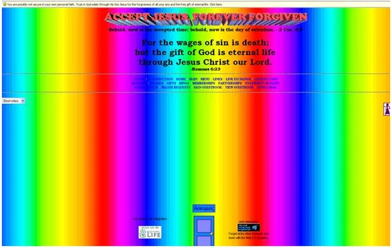
This flashing monstrosity can only be fully appreciated with a proper visit to the site.
 Again, another one you have to visit to believe. This site is meant to be a meditation website but after navigating some of the pages (Aloha is particularly bad) viewers are more likely to experience a sore head rather than relaxation. Crank up the volume to maximise headache potential.
 Yet more on-screen movement but this time an avalanche of white dots. Most of the links don't work either making us wonder if anyone has ever genuinely booked a ski rental in Utah.
 Now to the sites where more is less. This site is an icon-hater's worst nightmare. There are so many icons with unknown link destinations that it takes a while to work out what the site is about, let alone use it as an information source.
 This site is all about style and looking good which makes the choice of website design all the more confusing.
 This site has all the qualities of a bad site. Movement that makes the eyes hurt, random words and being generally odd.
 Moving even more into the bizarre is Kats. A site where "Kats" dance and then multiply for no particular reason.
 However, there is no site odder than Time Cube, where "Dr" Gene Ray argues that everything is a cube. The earth is a cube, time is a cube, people are a cube...
 While strictly not that bad a website itself, Wonder Tonic allows you to turn any site into a bad one complete with flashing icons, clashing colours and dancing babies.

Again, another one you have to visit to believe. This site is meant to be a meditation website but after navigating some of the pages (Aloha is particularly bad) viewers are more likely to experience a sore head rather than relaxation. Crank up the volume to maximise headache potential.
Yet more on-screen movement but this time an avalanche of white dots. Most of the links don't work either making us wonder if anyone has ever genuinely booked a ski rental in Utah.
Now to the sites where more is less. This site is an icon-hater's worst nightmare. There are so many icons with unknown link destinations that it takes a while to work out what the site is about, let alone use it as an information source.
This site is all about style and looking good which makes the choice of website design all the more confusing.
This site has all the qualities of a bad site. Movement that makes the eyes hurt, random words and being generally odd.
Moving even more into the bizarre is Kats. A site where "Kats" dance and then multiply for no particular reason.
However, there is no site odder than Time Cube, where "Dr" Gene Ray argues that everything is a cube. The earth is a cube, time is a cube, people are a cube...
While strictly not that bad a website itself, Wonder Tonic allows you to turn any site into a bad one complete with flashing icons, clashing colours and dancing babies.